FMJ.CO.UK HERMES UK CASE STUDY
AUGUST 2019 25
Homely. Although it is a tech hub and a
working environment, the space is designed
to attract and retain talent. Says Young: “We
spend on average 35 per cent of our working
life at work– that is, in the o ice – so making
our space feel more homely will in turn
improve the attraction and, importantly,
the retention of desirable employees. By
providing entertainment such as an Apple
home player, Xbox and so on, sta can
step away from the work side. When work
colleagues become friends, collaboration
improves.”
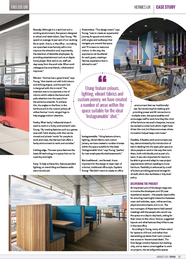
Vibrant. “Hermes has a great brand,” says
Young, “that stands out with bold colours
and striking shapes, and the tech hub
is designed with this in mind.” The
intention was to incorporate a mix of
colours which reflects the brand and
pulls attention into the space from
the entrance onwards. To achieve
this, the angles on the floor, in the
furniture and in the custom joinery all
utilise Hermes’ iconic winged logo to
help engage visitors’ attention.
Funky. What ‘techy’ millennial doesn’t
want to work in a funky environment? asks
Young. “By creating features such as a games
area with Tetris display units that can be
moved and private ‘nooks’ for people to
work and meet, the Hermes hub o ers a
funky environment to work and socialise.”
Cutting edge. The new space features the
latest AV technology in a space that can be
used day and night.
Sexy. To help achieve this, feature pendant
lighting, on-trend tiling and feature walls
were introduced.
Pantomime. “The design intent,” says
Young, “was to create an experiential
journey for guests and visitors,
with angles and walkways that
navigate you around the space
and TV screens to welcome
visitors. In this way, the
experience can be altered
for each guest, creating a
Hermes experience that is
tailored to suit.”
Instagramable. “Using feature colours,
lighting, vibrant fabrics and custom
joinery, we have created a number of areas
within the space suitable for the ideal
‘Instagramable’ shot,” says Young, “perfect
for new employees #lookwherewework.”
Not traditional – not formal. It was
important for the design to steer clear of
a formal, traditional o ice style. Explains
Young: “We didn’t want to create an o ice
environment that we ‘traditionally’
see. By introducing hot-desking and
providing power and AV connection in
multiple areas, the space enables and
encourages sta to work how they like. A lot
of the furniture we used is bespoke, because
we wanted a cooler look which might have
driven the cost, but there were areas where
innovation helped keep costs lower.”
Flexible. A flexible work environment was
key, demonstrated by the introduction of
bench desking into the open-plan space to
allow people to work in the way that suits
them, both individually and as part of a
team. It was also important for teams to
be able to grow and adapt to new project
requirements without needing to move
furniture. Flexibility is enhanced by a wall
of lockers providing personal storage for
all sta , which also facilitates a ‘tidy desk’
policy.
DELIVERING THE PROJECT
An important part of the design stage was
to involve the developers and UX (user
experience) experts – the people responsible
for ensuring meaningful interaction between
users and websites, apps, online services,
physical environments and so on. The
two managers of these teams held several
meetings with the people who would use
the space on a day-to-day basis, asking for
their views on the colour choices, suggested
layouts and what features they’d like to see
in the new o ice.
According to Young, many of them asked
for ‘space to chill out’, and rather than
demanding set desks their main concern
was access to ‘decent-sized desks’. The
final design solution features hot-desking
only, and as teams come together to work
on projects, the reconfigurable spaces
Using feature colours,
lighting, vibrant fabrics and
custom joinery, we have created
a number of areas within the
space suitable for the ideal
ƈInstagramable’ shot.”